Knowledge Base Design Tips for Better Self-Service Support


Building and maintaining a knowledge base can be hard work. And getting your customers to visit the knowledge base before asking for help can be even trickier!
A knowledge base isn’t useful if people can’t first find the right information, understand it, and apply it to their questions. Following some simple knowledge base design guidelines can greatly increase the usability of your knowledge base.
This is a chapter in our Ultimate Guide to Using a Knowledge Base for Self-Service Support. When you're ready, check out the other chapters:
Chapter 1 – Knowledge Base 101: Definition, Types, and Benefits
Chapter 2 – Quick Start Guide to Creating a Knowledge Base
Chapter 3 – Knowledge Base Design Tips for Better Self-Service Support
Chapter 4 – Incredible Knowledge Base Examples That Get It Right
Chapter 5 – Tips & Templates for Writing Great Knowledge Base Articles
Chapter 6 – Creating Knowledge Base Videos: Tips, Tools, and Examples
Chapter 7 – Simple Knowledge Base SEO Tips Anyone Can Follow
Chapter 8 – The Best Knowledge Base Software + How to Choose One
Chapter 9 – Actionable Knowledge Base Metrics to Start Tracking Today
Chapter 10 – Knowledge Base Tips for a Better Customer Experience
Chapter 11 – How to Revamp Your Knowledge Base Architecture
7 knowledge base design best practices
Product teams leverage UX resources, roadmaps and customer interviews to build great products.
In the same way, customer support teams have the opportunity to treat their knowledge bases like products by creating great content, focusing on design, making data-driven decisions, and remembering the mission of their team: to help customers.
Here are several knowledge base design best practices every team should follow.
1. Write clear, concise, digestible content
Customers come to your knowledge base when they have a question about how to use your product. They want answers. Give them the answers they seek by writing clear, concise, and easily digestible content.
Take time to ensure your documentation is up to date with the latest UI changes and that the steps outlined actually match what your customer will see in the product. Keep it simple: Give people the answers they need, and get them back into the product as quickly as possible.
2. Focus on design
Like any other product, the design of your knowledge base is incredibly important. Customers want answers to their questions quickly, but customer interactions within your knowledge base also present opportunities to thrill them with great design.
For example, add a prominent search feature to allow customers to easily search for relevant articles. Additionally, you can add links to your most popular content to the homepage of your knowledge base to allow people to access important content without ever leaving the homepage.
3. Make data-driven decisions
Data should drive every aspect of your knowledge base, from the content you write, to how to design your help pages, to how you identify potential improvements.
Digging into the reports that your knowledge base software provides will allow you to understand how customers interact with your knowledge base. In turn, that data will help you make better decisions about how to improve your knowledge base to better serve customers.
Metrics such as page views, bounce rates, and time on page can tell intricate stories of customer engagement. Take time to deeply understand this data, then make decisions based on your understanding. Data can act as a key to optimize user flows and help people access your content more easily.
4. Use the language your customers use
You might use your own marketing terms to describe features or elements of your service, but customers may never search for those terms. Review support conversations and chat transcripts to understand how customers talk about your offerings, and include those terms.
5. Show content in-app or on your site
Rather than wait for readers to arrive at the front door of your knowledge base, make the information visible right where they need it inside your application or on specific pages. Tools like Help Scout's Beacon can let you easily show the most appropriate content for the customer’s current goal.
6. Connect your knowledge base to your contact points
One reason customers reach out for your help is that they just don’t know your knowledge base is there. Link to your knowledge base prominently from the places people can trigger a support question, and help them help themselves.
7. Design for readability
Help your readers understand your content by applying simple knowledge base design tips like contrast and white space. We've included some best practices for help document design below.
Redesigning a sample help document
To best illustrate good document design, let’s start with a typical “knowledge lump” design. All the information on the page is accurate and useful, but the design is really letting it down.
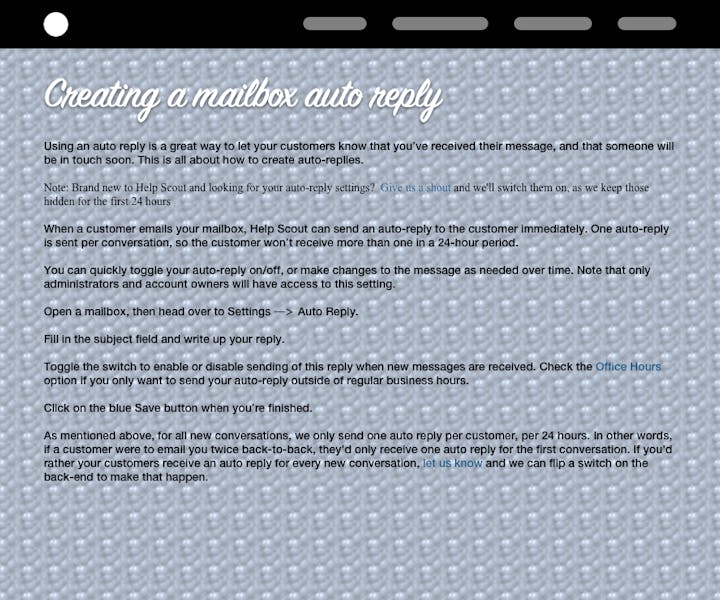
It’s hard to scan and unappealing to look at, and it’s likely that even people who would benefit from the information it contains would give up before reading it all.
By taking this document step by step through the principles of document design, we can make simple, iterative design improvements until we end up with a help page that’s vastly more readable.
Contrast
Contrast just means “difference,” and it’s a basic principle of design. For our sample document, that starts with giving the text a color that stands out from the background. We’ll use a plain background, avoiding textures or images that conflict with the text.
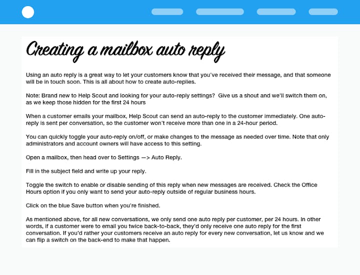
Already, it’s much easier to read, especially for the majority of people who don’t have perfect eyesight. We’ll use contrast again as we consider headings and callouts later on.
White space
White space refers to empty space around and between page elements (like text, page margins, and images), whether it is actually white or not.
A 2004 study by D.-Y.M. Lin found that the use of white space between paragraphs and in the left and right margins increased comprehension by almost 20 percent for older readers.
So let’s add some margins around our document, increase the line spacing, and separate our paragraphs a little.

Make your text larger
The all time record holder for most common complaint about websites is “the text is too small!” Of course your wonderful young eyes probably have no trouble at all reading microscopic text, but the rest of us appreciate something a little larger.
A good minimum font size to shoot for is 16px, although it’s the combination of font face, size, and line height that make up the overall readability level.
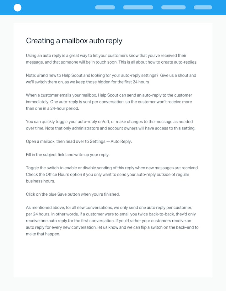
Use headings for simpler scanning
Break up long blocks of text with headings so that readers can more easily find just the section they are after. A heading with sufficient contrast and white space is a nice landing place for the reader’s eyes, and it can help them decide whether to invest more time on the page.
In our sample document, adding a few headings makes the overall content of the page much more obvious at a glance.

Use bullets, lists and anchors
Identify parts of your document that can be converted from prose into bullet points or numbered lists. If you have a set of steps that customers need to follow, or a few critical pieces of information to impart, those are great candidates for a list.

If your page is fairly long, consider adding a table of contents at the top. A well-written table of contents helps readers quickly understand what the document covers and allows them to jump directly to the information they need.
Extract key quotes
For quotes or important nuggets of information that stand alone (and aren’t part of a list), pulling them out of the text flow into a pull quote will make them easy to spot. In our example, we’ve emphasized the key step in the process to switch on their auto-reply settings.

Use screenshots and GIFs
Wherever possible, using a screenshot to show what you mean rather than laboriously describing it in text makes help documents more effective. In our example, we can greatly simplify our explanation by referring to the screenshot.

A good help document screenshot should:
Be large enough to be easily readable. You may need to crop a screenshot to keep the key information at a reasonable size while fitting into your page.
Contain visual context, so readers understand what they are looking at. Don’t crop too tightly!
Be annotated where appropriate (consider labeling items if you refer to them in your copy).
The same rules generally apply for animated GIFs and videos too.
Implementing design improvements
Depending on the knowledge base or CMS system you’re using, many of the visual styling improvements can be made through CSS changes and will apply across all your documents.
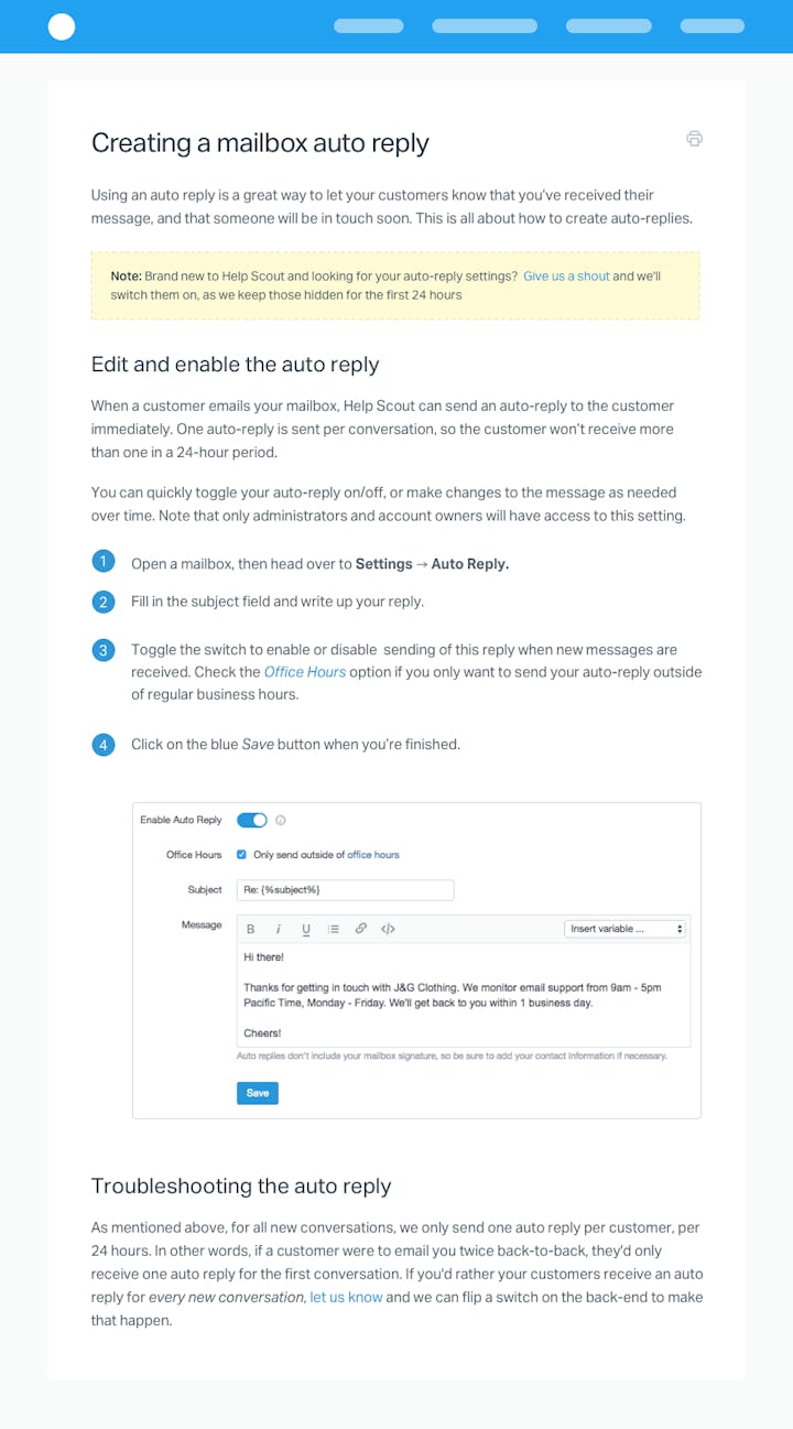
For structural improvements like lists and headings or for screenshots and videos, you have a little more work ahead of you.
Remember your goal: Helping customers
At the end of the day, the goal of your knowledge base is to help your customers. Use these questions as guiding lights when making decisions about your knowledge base design:
Does this help customers?
Will this change answer the customer’s question quickly?
Can customers get back to the product easily after finding their answer?
If a new header or article layout doesn’t help customers, then it doesn’t make sense to implement it. If it passes this base test, then test it further, watch how it impacts key metrics, and iterate to improve the feature.
Write great content, focus on design, make data-driven decisions, and, above all else, help customers use your product more effectively. Treating your knowledge base as a key product for your company enables you to create great customer experiences and build a strong, customer-driven product.
Mitchell Cox also contributed to this article.


