Illustrating the Help Scout Brand


Last month, Help Scout released our shiny new Brand Handbook into the wild! The handbook is an important brand expression for Help Scout, both as a tactical tool kit for talking about our brand, and as a piece that expresses how the values we hold as a company come to life.
Before diving into any visual work on the Brand Handbook, the design team set a few goals for the project. This handbook needed to:
Serve as both a creative expression of our brand and also as a resource for those working on or speaking about the brand.
State our brand values loud and clear.
Transform those brand values into a compelling story.
After some initial wire-framing, the plan was to introduce the Brand Handbook with a “scenic route,” with several brand illustrations leading a visually rich deep dive into our values. From there, visitors to the site could dig deeper to find guidelines and assets.
Brand illustrations: Where to start?
This past year, Help Scout underwent a large-scale visual rebrand. Over the course of that visual rebrand, the team identified five values that guide our brand. These are the values that have always been present in Help Scout’s ethos, and they will remain constant as guiding forces. Help Scout is:
Helpful
Human & Organic
Trustworthy
Energetic
Curious
Since illustration is a tool we lean into as a brand, we knew that creating an illustrated narrative for the Brand Handbook would be an ideal way to bring these ephemeral values to life.
Developing the Help Scout ‘blob system’
So how in the world do you draw a “value?” And how do you illustrate concepts of “trust” and “humanity” with imagery that isn’t just puppies and hearts and sunsets?
Our team did a lot of brainstorming about the idea of the brand as an ecosystem. We began to think of our brand values as elements within that ecosystem — intangible but essential forces that guide decision-making, nurture the work that we do, and manifest themselves in every bit of design that we ship. If our brand values were the elements in our Help Scout ecosystem, how could we represent them? What would the landscape look like, and what kind of people live there?
We knew we wanted Help Scout characters to coexist with a palette of new, more abstract visuals, but we had to make sure those abstract bits would complement our character-based illustrations.
To get the wheels turning, we started by studying our own character illustrations, looking for visual patterns.

If we were going to lean into this “blob system,” it needed to have some real meaning, with specific intention behind these abstract motifs. We iterated on ways to sketch representations of the five brand values in the simplest way possible. Here are the values and how they aligned with our blob system.
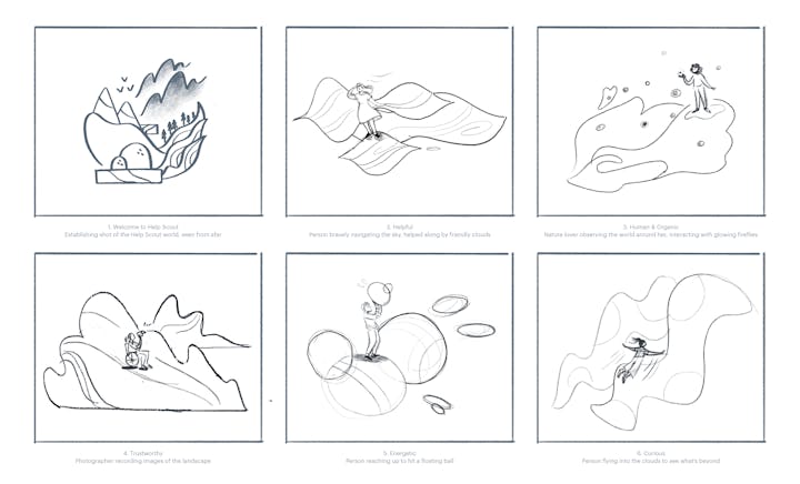
Helpful
We want to support, reward and delight folks in everything we do, whenever it’s appropriate. This shape is based on vocal sound charts, with the idea that when we’re helpful, we’re a friendly voice of guidance.


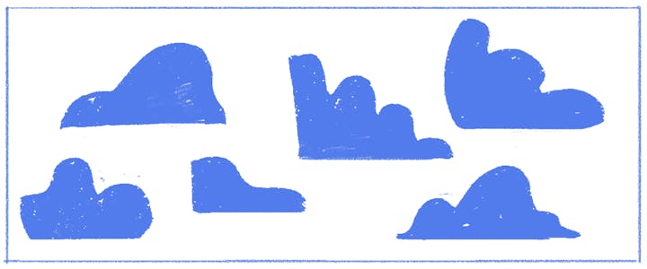
Trustworthy
Trusting something means that while that thing might shift over time, you can inherently rely on it. This shape ebbs and flows on the top, but it always sit on a solid, flat plane.
Energetic
We’re a playful brand, but not overly ecstatic. These bouncing balls shoot backward and forward, and they interact with each other in a calm, friendly way.


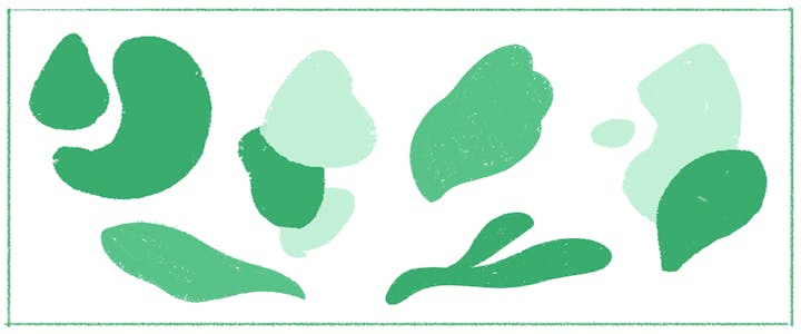
Human & Organic
Plants were the inspiration for this one. We referenced the process of plants growing and blooming and drew the shapes that form along the way.

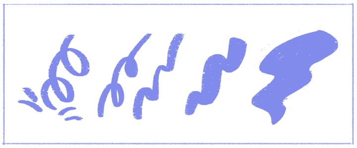
Curious
Curiosity pushes you forward and challenges you to think in new ways. These shapes are rooted in the idea of an abstracted spring or lightning bolt.
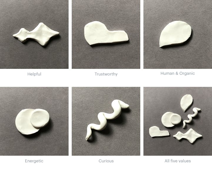
Attaching each value to a specific shape was starting to give a logical form to these abstract drawings. To distill the sketches further, we took a step away from 2-D and sculpted them out of clay to see what they’d look like as real objects.
At this point we started to zoom back out to consider how these elemental shapes would combine to form different landscapes in Help Scout’s brand world. Here are a few studies of what a landscape might look like using our toolkit of shapes:

Bringing brand values to life through story
Storytelling is fundamental to Help Scout’s visual brand. Now that we had the underpinnings of our Help Scout blob system, we began to think through what kind of story we could tell that would bring these five brand values to life. If we were traveling through our Help Scout world, what kind of people would we see? How would they be interacting with these landscapes formed by our values?
After a few rounds of sketching, we decided to lean into the idea of exploring a lush, other-worldly place. For this story, the Help Scout “world” serves as the establishing shot. We developed a troop of friends, each going off on their own adventure to explore one of our value elements and ultimately coming back together to guide you further into the handbook.
High fidelity blobs
With a visual tool kit and a story in hand, it was time to refine! We tightened up some guidelines for all of the pieces of our blob system, assigning specific colors and textures to each value and developing characters that could feel at home in their environments.


The stage was set, and our cast of characters were poised to begin their big adventure into the world of Help Scout. The next step was to make them move. My teammate, Erik Blad, will tell you more about the animation process in an upcoming post. Stay tuned!

These illustrations don’t just exist within the confines of the Brand Handbook — the new brand, its color palette, and the characters that populate the Help Scout world make their way not only into our marketing, but into the product itself. For example: check out the hero and spot illustrations in Help Scout’s own Docs. By the way, did you know Docs sites are completely customizable with CSS on every plan? Your knowledge base is a great place to showcase your branding!
